
Add a Linear Regression Trendline to an Excel Scatter Plot
You’re either reading this because you searched for how to add a linear regression trendline to an Excel scatter plot or you saw the title and thought, “Are these words even English?!” We’ll help you with both.

What Is Linear Regression?
If you know what a linear regression trendline is, skip ahead. Ok, now that the nerds are gone we’ll explain linear regression. Linear means in a line. You knew that. Regression, in math, means figuring out how much one thing depends on another thing. We’ll call these two things X and Y.

Let’s use the example of tracking the value of a single share in the stock market over the years. X will be time in years and Y will be the value in dollars.
We know that the value of a stock is changed by time passing, among other things. We can’t control those other things, but we can control when we sell the stock, so we control the time variable. But how dependent is the value of a stock on time passed?

If we bought a stock for $1 and in one year its value went up to $100, does that mean every year the value will go up another $100? Does that mean in 25 years it will be valued at $2500? We don’t know.
We figure it out by looking at how much the stock earned over several years. That’s fairly simple because we’re only measuring how much we change one thing or one variable. Then we put those measurements on a graph or plot. The dots could be all over the place or scattered.

Could we draw a line through the dots that would show a trend? Let’s call that a trendline. Yes, we can certainly try. That line is a simple linear regression trendline through a scatter plot. Now we know those words are actually English and what they mean. Let’s create one in Excel.
How To Create An Excel Scatter Plot With Linear Regression Trendline
Let’s assume you haven’t learned all about Excel yet. The first step is to create a scatter plot. Then we can create the trendline. Then we can do some neat things with the trendline and see what it means.
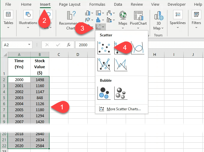
- Create 2 columns of data in Excel. Our example will have Time in years and Stock Value in dollars. You can copy and paste the data into Excel so you can play along. Then, in Excel, select both columns of data by selecting and holding on the top-left number and dragging down to the bottom-most number in the right column.
| Time (Yrs) | Stock Value ($) |
| 2000 | 1498 |
| 2001 | 1160 |
| 2002 | 1147 |
| 2003 | 848 |
| 2004 | 1126 |
| 2005 | 1180 |
| 2006 | 1294 |
| 2007 | 1420 |
| 2008 | 1322 |
| 2009 | 797 |
| 2010 | 1169 |
| 2011 | 1325 |
| 2012 | 1408 |
| 2013 | 1569 |
| 2014 | 1872 |
| 2015 | 2067 |
| 2016 | 2059 |
| 2017 | 2362 |
| 2018 | 2640 |
| 2019 | 2834 |
| 2020 | 2584 |
- Select Insert in the main toolbar.
- Look for the icon of a graph with just dots on it. Select the down arrow next to it.
- Select the first scatter graph with just dots and no lines.
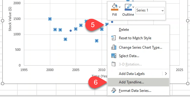
- Once the graph is built and you’ve customized the Excel chart to look the way you want it, right-click on a single data point. This can be a little tricky, so keep trying if you don’t get it on the first try. When you do, a sub-menu will open.
- Select Add Trendline.
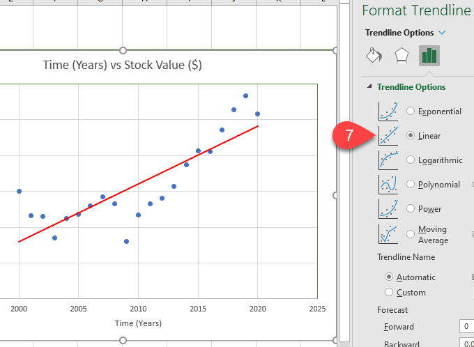
- The Format Trendline menu will open on the right. The Linear trendline option will already be selected. Leave that as it is. Feel free to work with the Excel formatting to make the line look nice. Now you have a linear regression trendline that shows you the general growth of the stock value over 20 years.
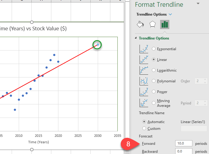
- Want to know what it will be worth in 2030? You can get a rough idea by adding 10 periods, or years, to the trendline in the Forecast Forward field. It will show that it’s valued at somewhere around $2500 by the dot in the green circle.
- If you want your chart to make you look smart, scroll down in the Format Trendline menu and check Display Equation on chart and Display R-squared value on chart. You’ll see something like what’s in the red box below appear on your chart.
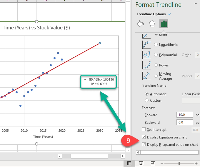
What Does The Equation and R-squared Value Mean?
These are handy to have. The R-squared value tells you just how good the trendline fit is. Although an R-squared value above 0.8 is ideal, 0.69 isn’t bad though. Think of it as you being 69% confident that this line will give you a good insight into how this stock tends to perform.

The equation makes it easier for you to do quick calculations to figure out what the stock value on the trendline is at any point in time. Even before the line begins and after it ends. What might the stock be worth in 2030? Let’s plug it into the equation.
Y = 80.468 x X – 160136 – where X is 2030
Y = 80.468 x 2030 – 160136
Y = 163,350.04 – 160136
Y = 3,214.04
Yes, if the trend holds, the value of the stock has a decent chance of being worth $3214.04 in 2030.
What Will You Do With A Linear Regression Trendline?
We’ve shown you an example of how a linear regression trendline in Excel might help you make a financial decision. But what other ways could you use it? Are you coming up with ideas? Let us know.
from Online Tech Tips


0 Comments